How to create a dynamic chart in Excel using Dynamic Arrays
I've been increasingly interested in how we can use Dynamic Arrays in our models to achieve timeline flexibility. This is especially useful for charts.
Geez. Snappy title, eh?
I've been increasingly interested in how Dynamic Arrays can be used in our models to achieve timeline flexibility. This is especially useful for charts.
Sometimes, we want to be able to select the time range that we display in our charts. Charts help us "see" the data to explain or understand patterns or commercial dynamics. It's helpful, therefore, to be able to "focus" on particular time periods. The problem with Excel charts historically has been their fixed ranges. If we wanted to focus on specific time periods, we had to edit the chart to select the range we wanted to focus on. Dynamic Arrays change this.
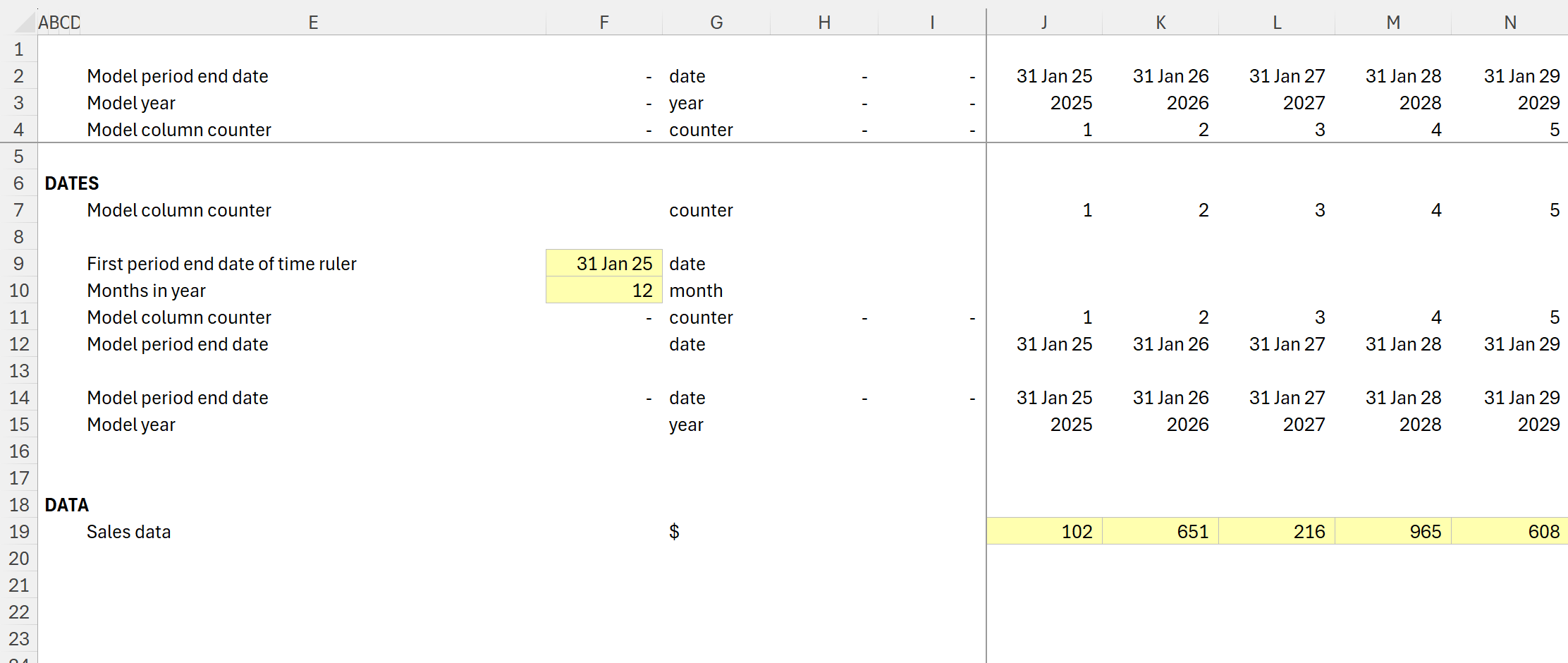
In this worked example, we have some meaningless dummy sample data and a simple annual model timeline. To keep the example file simple, I've kept all the inputs and calculations on the same sheet.
The worked example file can be downloaded below.
How to set up a dynamic timeline for our chart using the FILTER function
The first thing we need is the time series for our chart.
We're going to use the FILTER function for this. This will allow our chart's time series to be a Dynamic Array. Using a Dynamic Array function, the array size will adjust automatically if we change the inputs for our time series.
(Thanks to Brian Vadden for the tip on using the FILTER function for this!)
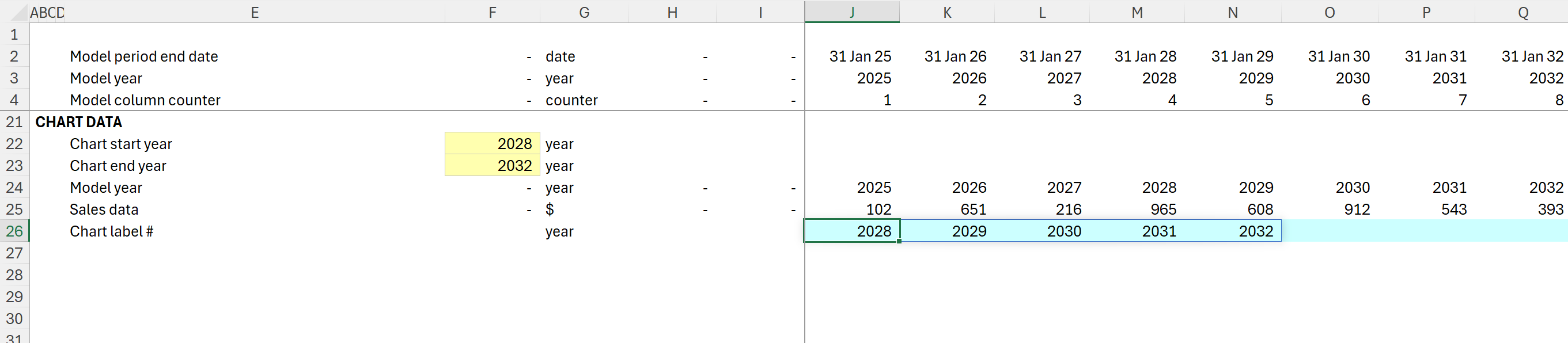
Firstly, I set up my block to gather the ingredients I need. I've added the chart start and end years as inputs and linked to the model timeline and the sales data:
See: How to add inputs and How to create links
We then use the FILTER function to create a Dynamic Array containing the years we want to focus on:
The FILTER function has 3 Arguments:
FILTER( array, include, [if empty] )
Array: The array or range to filter. In our case, this is the model year range in Row 24.
Include: A boolean array whose height or width is the same as the array to be filtered. In our case, we only want years that are bigger than or equal to the start year and smaller than or equal to the chart end year. Here, we use the multiplication operator (*) to filter the data using multiple criteria.
[if empty]: This is an optional argument that tells the function what to return if the filter returns no data.
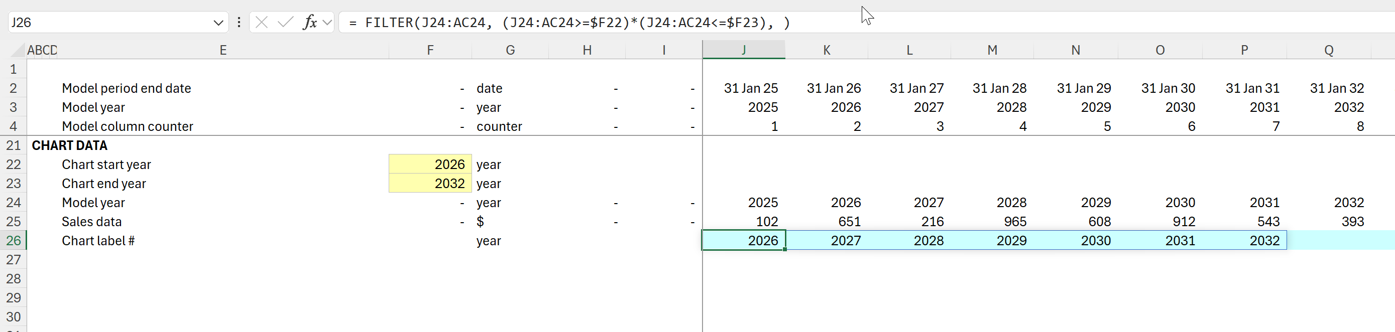
The formula in J26 is therefore:
= FILTER(J24:AC24, (J24:AC24>=$F22)*(J24:AC24<=$F23), )
I have included the # symbol in the row label in E26 to indicate that the row contains a Dynamic Array.
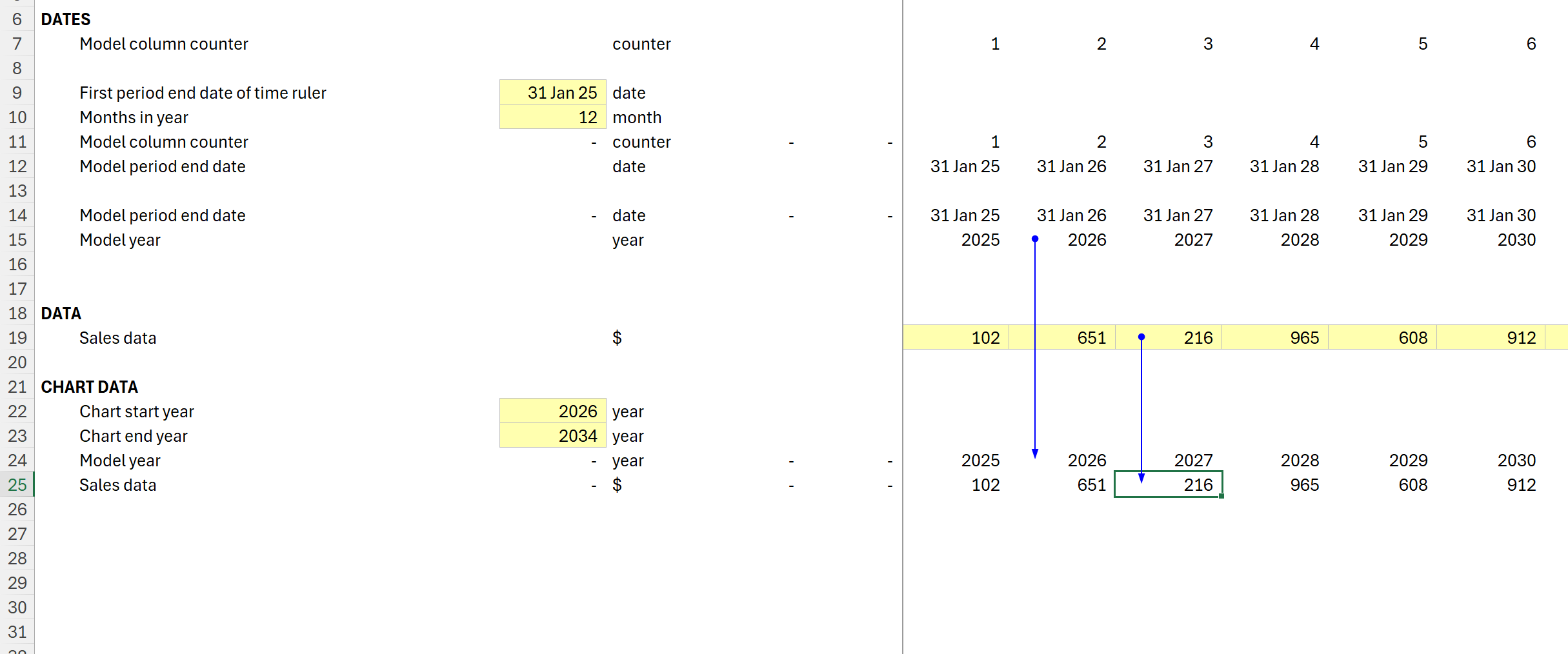
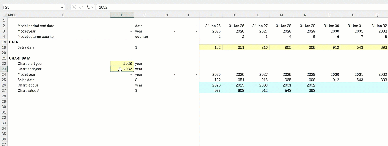
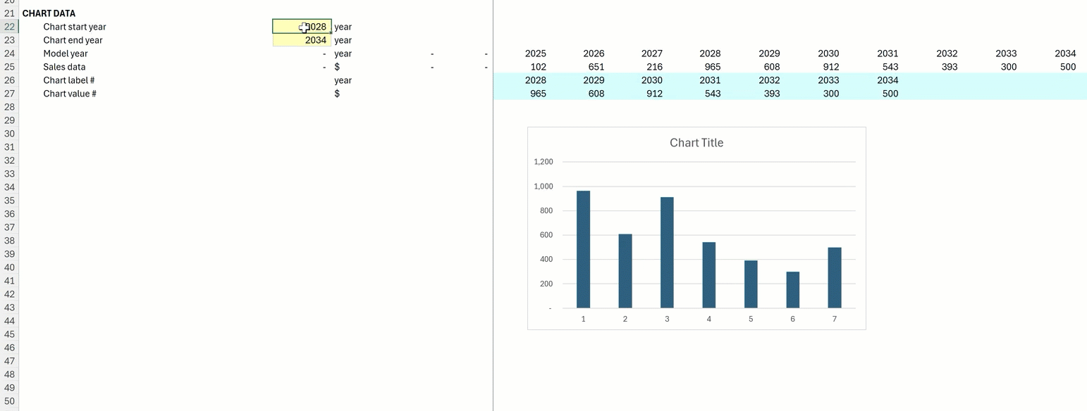
The result in row 26 is a Dynamic Array. If we change the start year to 2028, for example, we get the following:
How to select the data for our chart using XLOOKUP
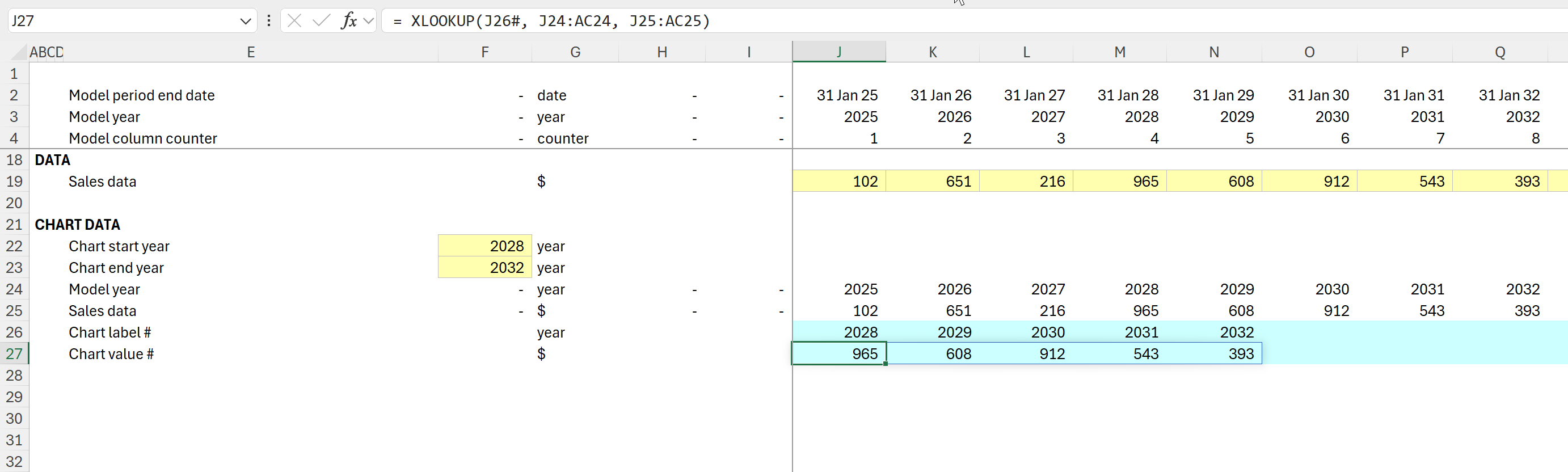
Now that we have the time range for our chart, we need to select the corresponding sales data for that time range. We also need this data to be a Dynamic Array so that when the chart time series Array changes, the selected sales data Array matches it.
We can do this using the XLOOKUP function. XLOOKUP is also a Dynamic Array function.
In the XLOOKUP function, we are using three arguments:
= XLOOKUP( lookup_value, lookup_array, return_array)
lookup_value: The first argument tells the function what to look for in the lookup_array. In this case, I have referred to the Dynamic Range in row 26. We indicate this by including the first cell in the array plus #—giving J26# in this case. This causes the data to be returned by the function to be a Dynamic Array.
lookup_array: in this case, this is our model timeline array in row 24.
return_array: this is our sales data in row 25.
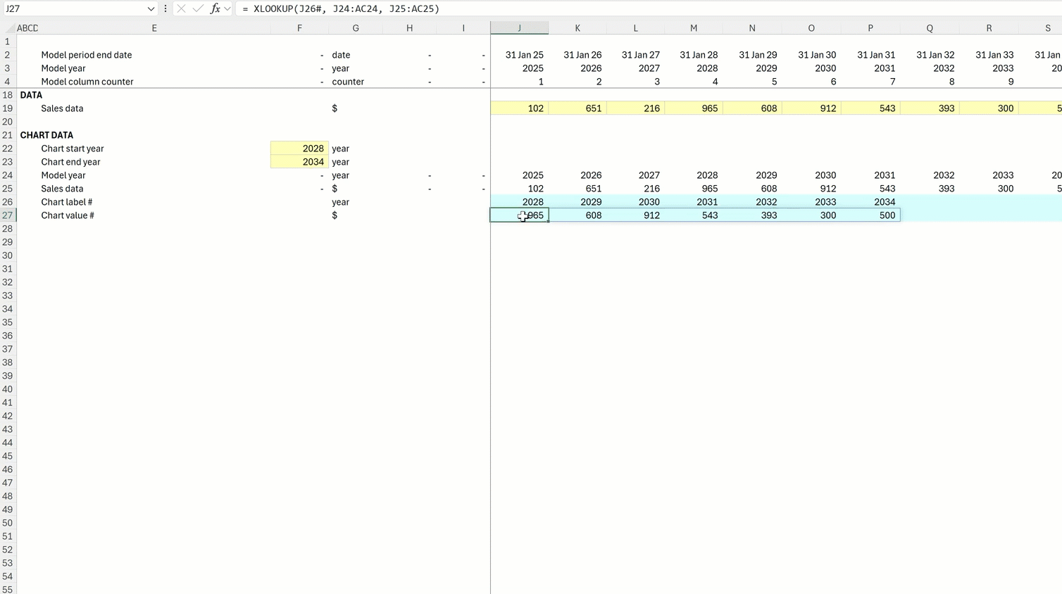
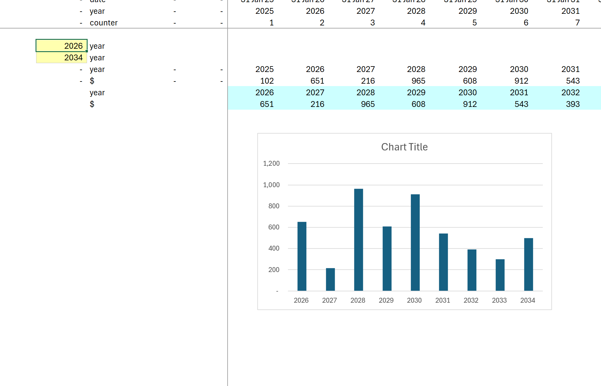
We now have the chart timeline and the chart data as Dynamic Arrays. If we change the chart end year to 2034, for example, both Arrays will change size:
Including Dynamic Arrays in a chart in Excel
Now that we have the chart data and the timeline as Dynamic Arrays, it's time to set up our chart.
Setting up a quick chart using our Sales data Dynamic Array is easy.
To begin with, we select the Sales data and hit Alt+F1 (Option+F1 on Mac) to insert the chart:
This chart will already work dynamically. As we change the inputs for start and end year, the chart will update automatically:
However, the problem with the chart is the data displayed on the X-axis. The chart currently shows numbers beginning with 1 for the number of data points we have. This isn't useful in this case, as we want to see the specific year that each data point refers to.
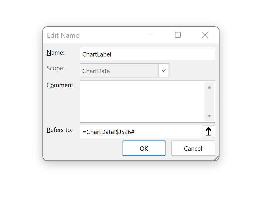
To have the chart display the years, we will have to use a Named Range to refer to the years that we want to show on the X-axis.
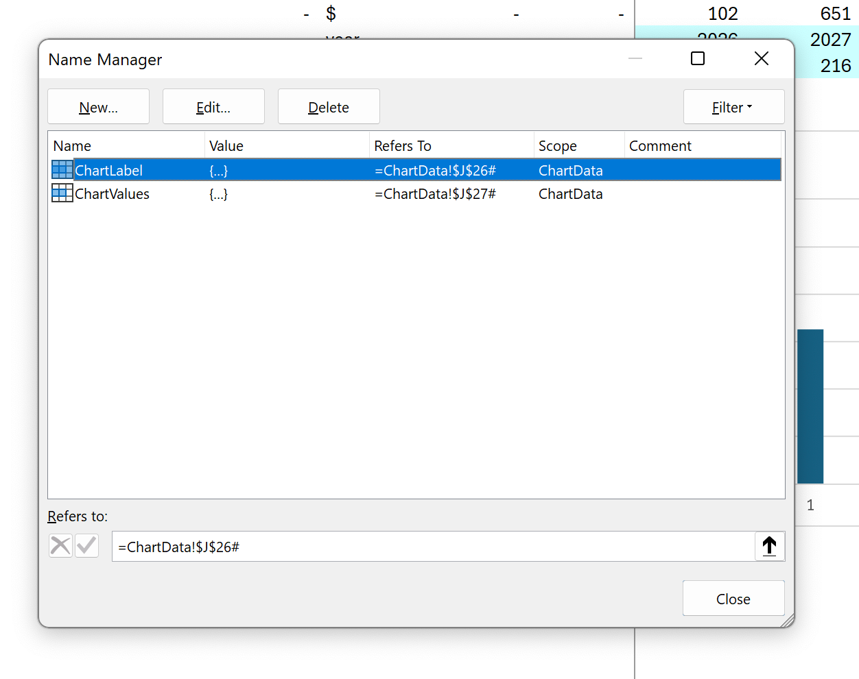
Using Excel's Name Manager (which we can open with Ctrl+F3), we set up two Range Names. I have called these ChartLabel and ChartValues)
Just as we did in the XLOOKUP formula, we are going to refer to the Dynamic Ranges in the name by including # in the array reference:
We'll do the same for both Range Names we need for the chart, one for Labels and one for Values. Of course, we would use more specific Range Names if we had multiple charts.
We can now update our chart to use these Range Names.
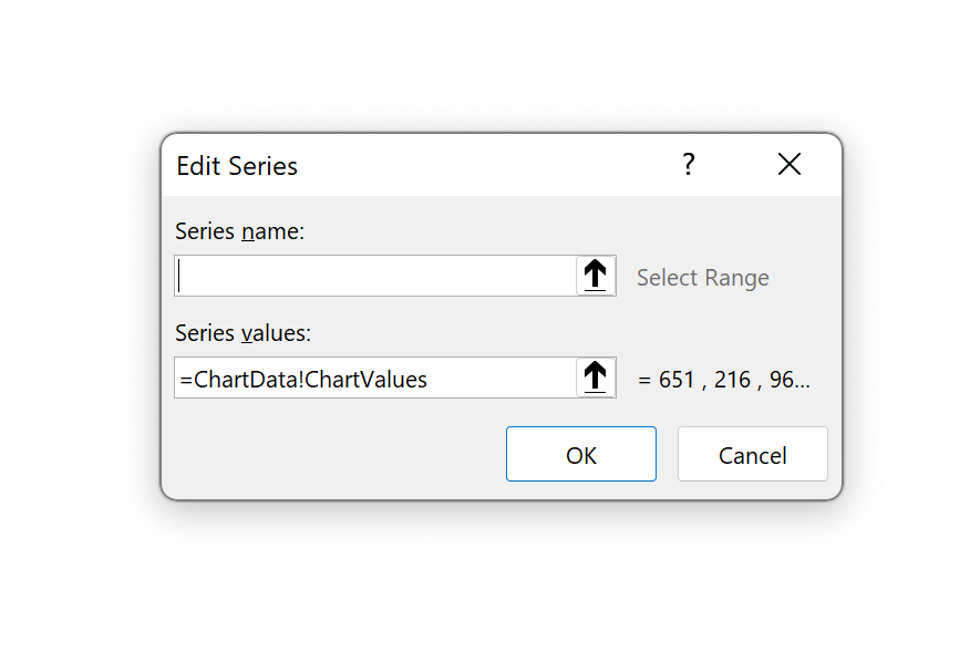
Right-click on the data series in the chart and choose "Select data":
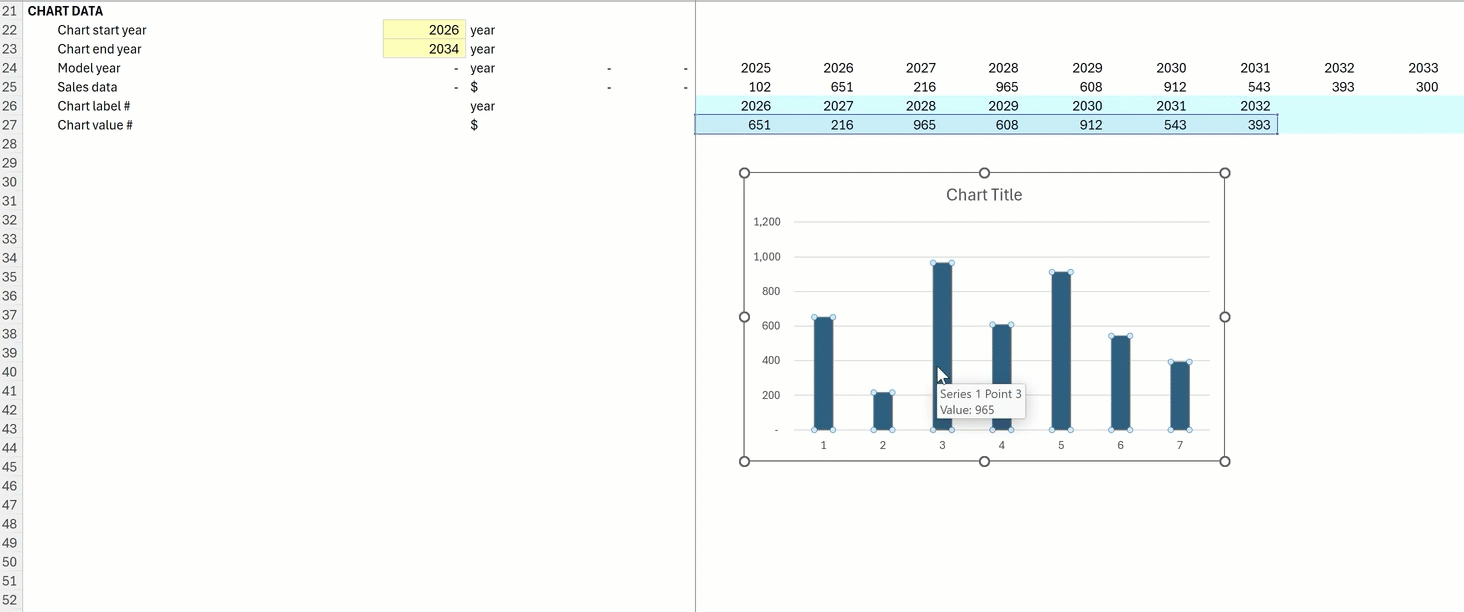
We then update the Series1 data to refer to the ChartValues range name:
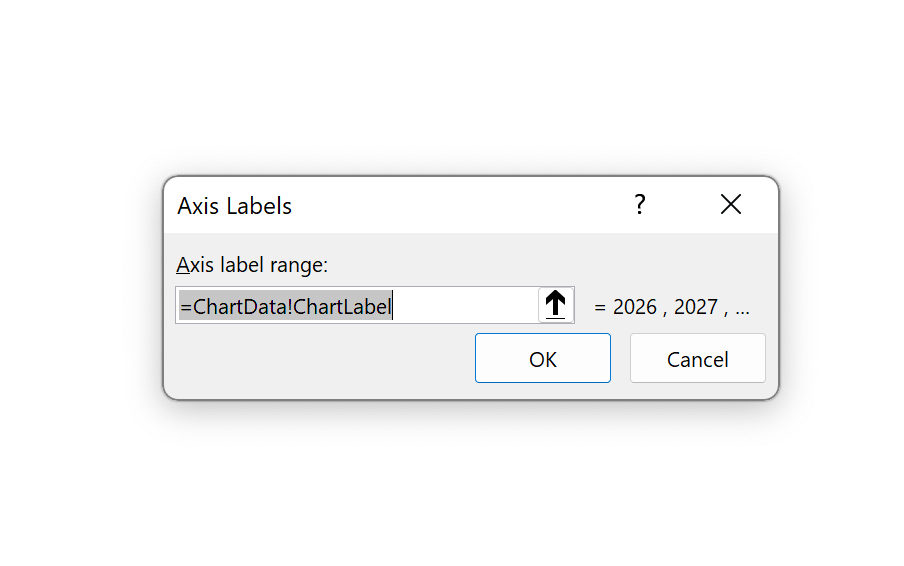
We update the labels to refer to the ChartLabel range name:
Our chart now looks like this, and when we update our start and end year inputs, the data and the labels on the x-axis update dynamically:
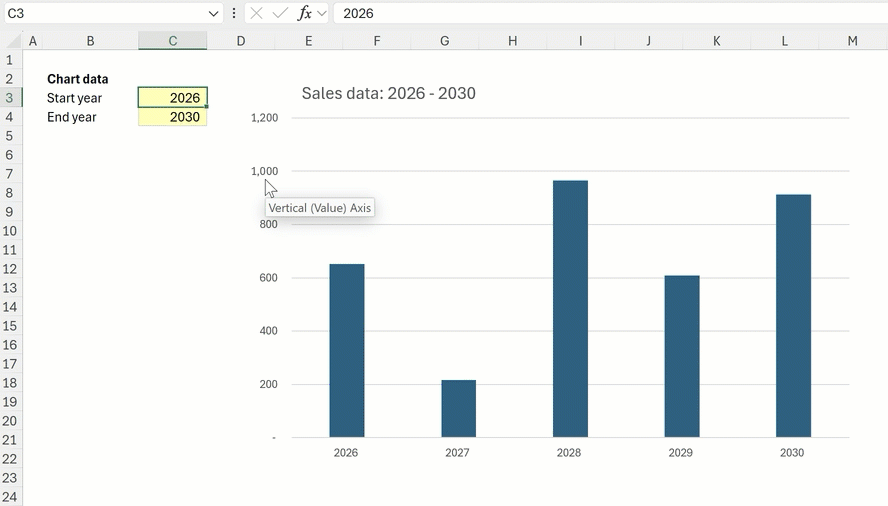
How to add a dynamic chart title
A final useful update we can make to the chart is to include a dynamic chart title that makes it clear what time range it is showing. To do this, I have created a concatenated text label that refers to the start year and end year:
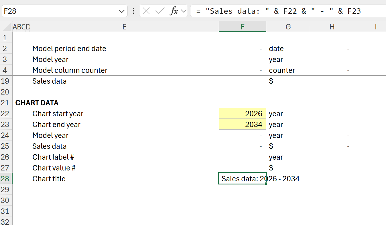
To include this in the chart, click on the chart title and add the cell reference of the new dynamic chart title in the formula bar:
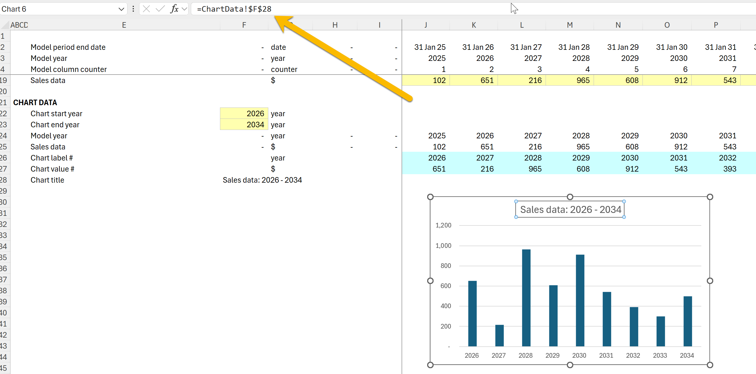
Our fully dynamic chart is complete. We could now move it to a dashboard, display the year inputs next to the chart, and make it all super sexy.
Here's the worked example file for reference.
In the comments, let me know how you get on with this or if you have any suggestions for improvements!
Comments
Sign in or become a Financial Modelling Handbook member to join the conversation.
Just enter your email below to get a log in link.